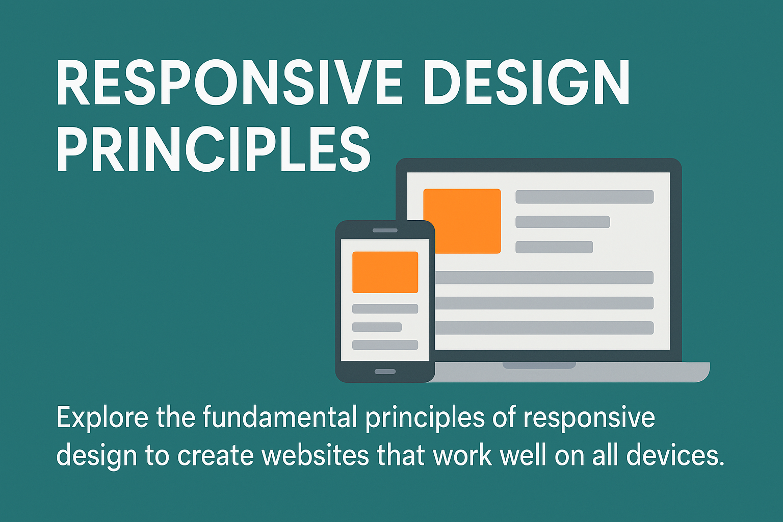
Responsive Design Principles
Responsive design is a key approach in modern web development, aimed at providing the best user experience across all devices: mobile, tablet, and desktop.
In this article, we’ll cover the core concepts of responsive design and best practices for adapting websites to different screen sizes effectively.
What is Responsive Design?
Responsive design means creating interfaces that automatically adjust to the user's screen size. This is mainly achieved using flexible grids, CSS media queries, and adaptive content.
Media Queries
Media queries allow you to apply specific CSS rules depending on screen width. For example:
@media (max-width: 768px) {
  .container {
    padding: 1rem;
  }
}
Flexbox and Grid
Modern layout systems like Flexbox and CSS Grid make building responsive layouts easier. For example:
.container {
  display: grid;
  grid-template-columns: 1fr 1fr 1fr;
}

@media (max-width: 768px) {
  .container {
    grid-template-columns: 1fr;
  }
}
Responsive Images and Content
Using responsive images (<picture> or srcset) is essential to avoid loading large files on mobile, and content should remain readable and easily clickable on all screen sizes.
Best Practices
- Use relative units (
em,rem,%) instead of pixels - Test your UI on multiple devices or using browser dev tools
- Favor a mobile-first approach, starting with small screens and expanding up
Conclusion
Responsive design is no longer optional — it’s a standard. Mastering its principles ensures a consistent and smooth experience for users on any device.