The European Accessibility Act: what changes on June 28, 2025 for developers
On June 28, 2025, the European Accessibility Act (EU Directive 2019/882) starts to apply. Until now, digital accessibility obligations mostly targeted the public sector. From now on, many private services must also be usable by people with disabilities. For product teams and developers, it is a major change.
This article is a technical summary, not legal advice: for your specific situation, talk to a lawyer.
Who is affected?
The directive covers products (computers, smartphones, payment terminals, e-readers…) and above all services, including:
- E-commerce: consumer-facing shopping sites and apps.
- Consumer banking services.
- Passenger transport: websites, apps, online ticketing.
- E-books and electronic communications.
Micro-enterprises providing services (fewer than 10 employees and under €2 million in turnover or balance sheet) are exempt. Transition periods exist for some services and contracts already in place.
The technical reference: WCAG 2.1 level AA
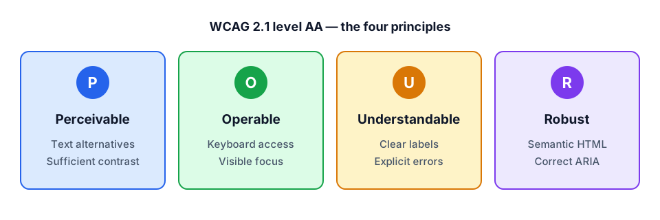
In practice, compliance relies on the European standard EN 301 549, which for the web adopts the WCAG 2.1 level AA success criteria. They are organized around four principles.
The most common mistakes (and how to fix them)
1. Images without a text alternative
Every informative image needs a descriptive alt attribute. A purely decorative image should have alt="" so screen readers skip it.
2. Insufficient contrast
Body text needs a contrast ratio of at least 4.5:1 against its background (3:1 for large text and UI components). Trendy light grey on white often fails.
3. Clickable elements that are not buttons
// ❌ Not keyboard accessible and invisible to screen readers
<div onClick={openMenu}>Menu</div>

// ✅ Focusable, activates with Enter/Space, announced as a button
<button type="button" onClick={openMenu} aria-expanded={isOpen}>
  Menu
</button>
4. Forms without labels
A placeholder is not a label: it disappears while typing and is not always announced. Every field needs an associated <label>, and errors must be linked to the field.
<label htmlFor="email">Email address</label>
<input
  id="email"
  type="email"
  aria-invalid={!!error}
  aria-describedby={error ? "email-error" : undefined}
/>
{error && <p id="email-error">{error}</p>}
5. Invisible focus
Removing the focus outline (outline: none) without replacing it makes keyboard navigation impossible. Use :focus-visible to show a clear indicator only during keyboard navigation.
A method to get compliant
- Audit: start with critical journeys (sign-up, purchase, payment) rather than the whole site.
- Automate what you can: axe-core (through
@axe-core/playwrightor the browser extension) and Lighthouse catch roughly a third to half of issues. - Test manually: keyboard-only navigation, screen readers (VoiceOver, NVDA), 200% zoom.
- Fix it in the design system: a component fixed once is fixed everywhere. Primitives such as Radix UI already handle focus and ARIA attributes.
- Publish an accessibility statement and a way to report issues.
Conclusion
The European Accessibility Act turns accessibility from good practice into an obligation. The good news: most of it comes down to semantic HTML, sufficient contrast and working keyboard navigation. Built in from design and into the design system, accessibility is cheap; bolted on at the end, it is expensive.